Wall colour is a great way to instantly refresh a room. Compiling moodboards with Pinterest or magazines will narrow down a style but the choice of colours out there is so overwhelming and then, we get influenced by trends as well... But colour is a very personal matter and our homes should give us the emotional state we need and reflect who we truly are. So, I wanted to look at the psychology behind colour to help you find your perfect match.
Black
Dark hues are very on trend at the moment and we can see the appeal as it makes a beautiful backdrop for photoshoots. But is it not all a bit too gloomy in real life? The colour of all things dark, black also represents power, strength and wisdom. In fashion, it is considered sophisticated and slimming. In interiors, black similarly absorbs light and makes walls recede, making a room appear bigger. It will create a cocoon, be reassuring and definitely glamorous, especially with touches of gold. It works particularly well teamed with white. Little Greene Jack Black is your absolute black.
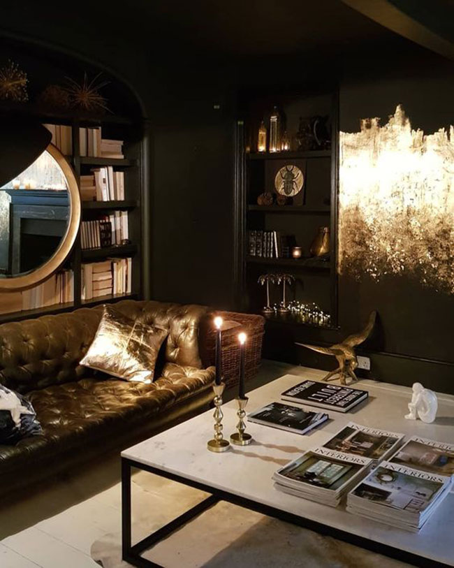
Kate Learmonth's living room - black and gold walls and white floor
Blue
In a dark shade, a better choice than black for some. It instils a similar sense of serenity but might be more soothing and tranquil. It has a strong impact on the mind. It will promote clear thoughts in its stronger hues and lighter tones will calm the mind. However, it can also represent formality and might be too cold and unemotional for some. Why not mix different shades of blue for a dynamic effect? Try Farrow & Ball St Giles Blue and Pitch Blue.
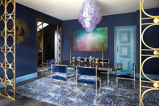
Dining room by Trilbey Gordon
Red
Compared to blue, red is a very physical colour, it stimulates, excites. A red room will be inviting and energising. Bright reds will perhaps be best used in a dining room or a hallway. But a deeper red could work well in a bedroom to unleash your passion... Crimson Red by Dulux, a deep rich red, might work for you.
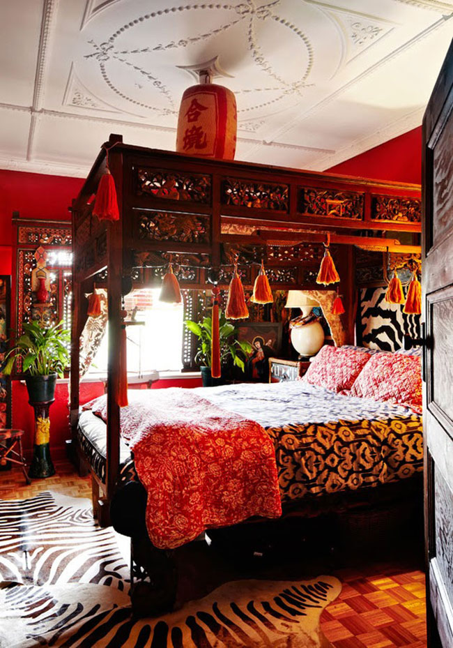
Peter Curnow and Gavin Brown's bedroom - photo by Armelle Habib
Orange
Another stimulating colour but less aggressive and full-on as red. Playful, frivolous and sensual, it gives physical comfort, but beware of using it in the kitchen as it will open an appetite! Wonderfully fun in a hallway as seen recently seen in Matthew Williamson's home. Little Greene Orange Aurora is a lovely coral for those after a softer shade.
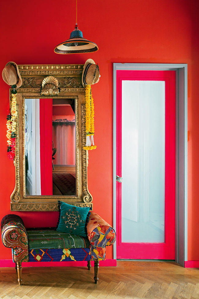
Matthew Williamson's hallway
Green
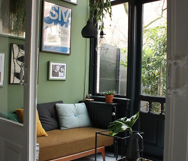
Green is for balance and harmony. Symbolising hope and abundance in nature, it is grounding and induces a sense of 'nothing to worry about'. Great for living rooms, bedrooms and offices. Try Vert de Terre by Farrow and Ball for an earthy, calming natural green.
Pink
A tint of red, pink also affects us physically, but it soothes, rather than stimulates. Feminine and nurturing, it is a comforting colour. Use dusty pink for a smooth shrouding effect or magenta for impact. This stunning entrance hall is wearing Benjamin Moore’s Cinco de Mayo.
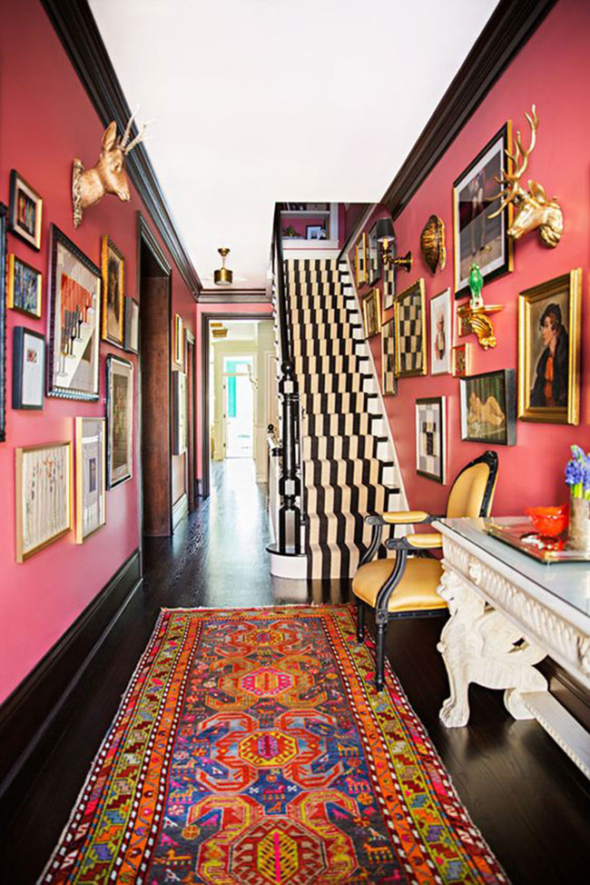
Entrance hall by Summer Thornton
White
Fresh and bright it fully reflects light, thus increasing the impression of space. Perhaps too clinical for some. Best used with natural tones such as wood and stone but also a classic paired with black. I like Dulux Pure White.
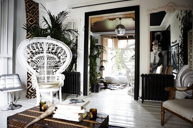
Sera of London's Alma Square Living room
Purple
Pantone colour of the year, and the colour of royalty. Dramatic, it conveys a sense of dignified opulence. It is an introspective colour that encourages contemplation and meditation. Beware as the wrong hue will instantly look cheap and tacky! You might like Abigail Ahern paint in Bleeker for a deep plum.
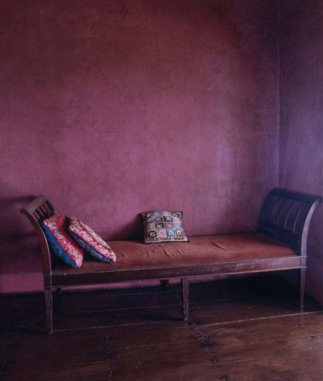
via Pinterest
Yellow
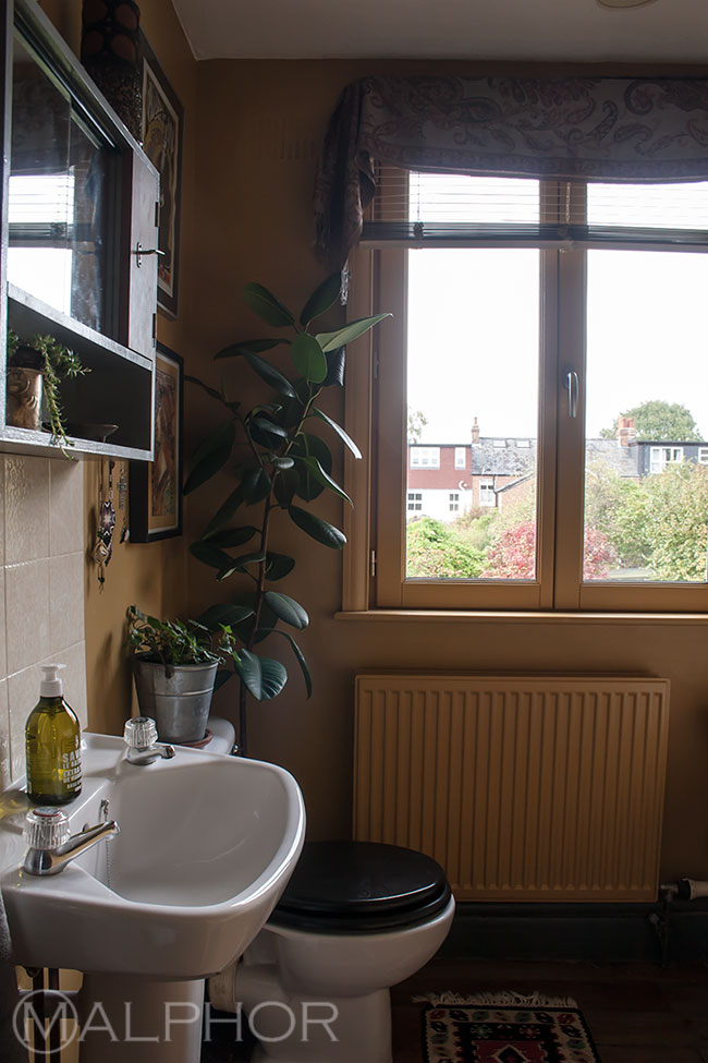
Cheerful colour to boost self-confidence and creativity. Perfect for a kid's room. Bright yellow is best used sparingly as it has a strong psychological impact and can easily become overwhelming. A mellow yellow such as ochre can be used a bit more freely and will add warmth to a north facing room. This is my bathroom in Farrow and Ball India Yellow.
Brown
As serious as black but softer and warmer. Earthy and natural, it is not as cold as black and feels as lush as chocolate. Try Crocodilo vinyl wallpaper from Osborne & Little or Cassandra Ellis Bitter Chocolate Modern Emulsion.
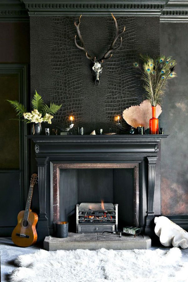 Fiona Ellis and Scott Hendrie's Living room
Grey
Grey is a neutral colour which means that it doesn't have a psychological impact. Perhaps this explains its popularity. There are so many different shades of grey that it makes this colour extremely versatile and used savvily, it creates a timeless interior. Try BTWN Dog & Wolf from Paint and Paper Library.
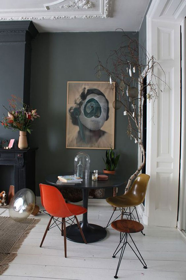
Theobert Pot's living room
So! I hope this has made it a little bit easier for you to make your mind up. I chose Farrow and Ball's French Grey, a green-ey grey, for my living room. I'll post some pics as soon as the room comes together...
